


Brand Evolution: Uklon presented an updated brand platform to scale into an ecosystem
The company is moving away from the single-product concept: to the umbrella brand Uklon, which unites Ride Hailing, Delivery, Ads, Travel, Store, and easily adapts to new directions and markets.
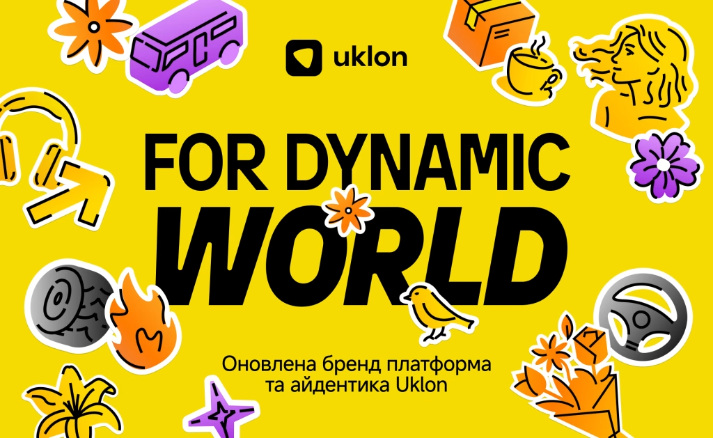
Uklon has presented an updated brand platform, “For Dynamic World,” along with a new visual identity. At the core of the architecture is the umbrella brand Uklon and integrated individual sub-brands for existing and new products: Uklon Ride Hailing, Uklon Delivery, Uklon Ads, Uklon Travel, and Uklon Store.
The brand’s evolution—both in its architecture and visual identity—is an integral part of transitioning from a single-product online car-hailing service into an ecosystem of products and services spanning urban mobility, passenger transport, logistics, travel, e-commerce, advertising, and delivery.
The “For Dynamic World” brand platform was developed in partnership with the creative agency IAMIDEA. It is built around supporting individuals and businesses in a world where changes happen faster than people can adapt to them. Uklon doesn’t demand extra effort or constant productivity from the user; instead, it creates an ecosystem of solutions that allows people to move at their own pace while maintaining a sense of comfort every day.
“Over 16 years, Uklon has grown from a startup into a true lovemark with a high Brand Strength Index (BSI) of 70. We have evolved from a car-hailing service into a large-scale ecosystem of solutions standing behind every move of individuals and businesses. A strong brand needs evolution, not revolution. That is why we are creating a strategic superstructure in the form of an umbrella brand. In this dynamic world, Uklon remains a ‘partner in life’ for millions of Ukrainians, helping them keep their day under control and feel supported during a trip, delivery, work, travel, business, or partnership,” notes Viktoriia Kovalova, Vice President of Brand and Loyalty at Uklon.
“When a company becomes an ecosystem, the hardest part isn’t adding new products, but finding the core idea that explains why they exist together. While working on the brand platform, we realized that people don’t wake up thinking ‘I need to call a car.’ They wake up thinking ‘I need to make it on time’: reach an important meeting, send flowers to mom, pick up a child from practice. That is why we built the brand platform around the role Uklon plays in a person’s life. Because the most valuable thing a brand can offer today is not just another service, but the ability to live at the same pace as the world,” shares Ihor Finashkin, Founder and Creative Director of I AM IDEA agency.
The updated identity retains Uklon’s signature colors (yellow, black, white) and guitar-pick shape (mediator). However, they now operate under new rules and logic. Additional accent colors have been introduced for ecosystem products (Uklon Delivery, Uklon Ads, Uklon Travel, Uklon Store), ensuring recognition for each service under the master brand umbrella.
Additional new attributes of the visual brand identity include:
-
Unique Custom Font (“Uklon RUKH CAPS”): Font shapes reference road themes—roads, turns, and motion. Variable tilt adds dynamism to the typography and visually conveys a sense of speed.
-
2D & 3D Element Integration: A blend of sleek 2D graphics with volumetric 3D elements. Sticker graphics easily adapt to various formats, enabling quick branding across diverse materials and media. Tied to urban culture—of which Uklon is a part—it forms a recognizable style and expands creative possibilities for visual communication.
-
Dynamic “Pin” Symbol: The navigation “Pin” symbol has become volumetric and expressive. It now “lives” inside the app, changing perspectives and facial expressions to act as a genuine guide for every trip.
-
AI-Friendly Identity: The brand book includes pre-written prompts for generating images and visual elements using AI.
Changes are already visible on the main screen of the Uklon rider app. Users now see not only the familiar city map but also all ecosystem products and services. This makes navigation intuitive and allows users to fulfill various needs in a few clicks. The Driver App update returns to Uklon’s baseline palette—black and yellow—with a redesigned icon. Phasing out green unifies the visual system and ensures brand consistency across all touchpoints, reinforcing the brand attribute of “equality among all audiences.”
The rollout is actively underway—branded cars and billboards are already visible across cities in Ukraine and Uzbekistan. To monitor transition quality across all touchpoints, Uklon is introducing its own proprietary metric: Brand Identity Consistency Index. Explore detailed changes at: https://branding.uklon.com.ua/
